Our latest news and views English
Underpinned by our Scandinavian design heritage, we bring you regular stories about architecture and interiors, exploring natural materials, acoustics, and the creation of safe and harmonious environments.
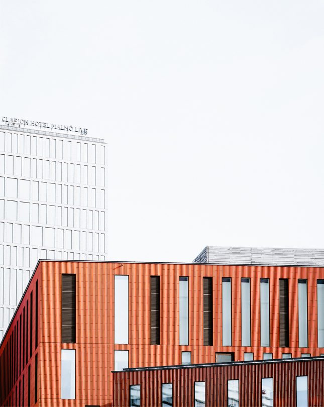
In this third interview with architects behind leading concert halls, we talked to Kristian Ahlmark of Schmidt Hammer Lassen about the Malmö Live centre, exploring how this “city within a city” was designed for the local community. Opened in 2015, the development brought a concert hall, conference facilities, a hotel and new housing to the city of Malmö in the south of Sweden.

The word “common” is not usually associated with an award-winning concert hall, but it is a word that architect Kristian Ahlmark of Schmidt Hammer Lassen uses often and positively to describe Malmö Live in the south of Sweden, which began as a 2010 competition organised by the City of Malmö, completed by the Copenhagen architects with Skanska in 2015. The concert hall, clad in light natural oak and touches of brass, is only one of the large-scale building’s many names and functions.
A “little city within a city”, a “People’s House”,
Malmö Live has many identities, each one connecting happily to the other, and to the city itself.
A 1,600-seat concert hall for the Malmö Symphonic Orchestra to work and perform in, but also a congress centre and hotel – three large venues that instead of being presented side by side, are linked by common flexible spaces where people spill out and music meets and integrates into the everyday. “It’s like a community house,” says Ahlmark. There is even a “living room” where activities play out side by side, as well as a small recital space and rooftop “sky bar” and restaurant. The brief was to be vibrant and sustainable – both boxes ticked.
This anti-elitist sentiment is manifest in the very being of the architectural configuration, presenting as seven elements like a cluster of boxes, each one “twisted and turned’ to face a different urban context: to the south the canal and the small-scale part of the city; to the west Central Station; to the north the harbour and the university; and to the northwest the harbour and residential area. “There is no front or back, but eight different entrances,
so you can just walk in from many places. The lobby space is then lifted up and hovers above, while we took the granite pavement from the outside and seamlessly swept it through the ground floor so it has that feeling of openness. We wanted to bridge the gap between the music of the Malmö Symphony Orchestra and the greater public audience.”
The configuration also created a new series of city and landscape spaces outside, including a square to the north and a port walk towards the canal: “It was only used before as a place where people threw junk and stolen bicycles, but now people come to congregate, get a coffee, sit in the sun.”
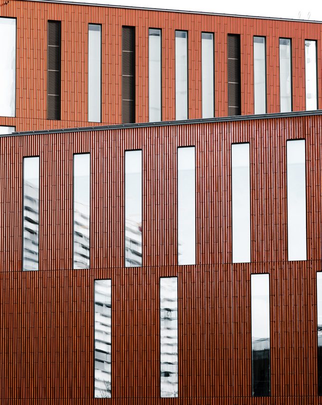
Yet this little city within a city is still unified, thanks to the façade’s glazed ceramic tiles that connect to history and poetic imagery: “We wanted to make a façade that swept like a veil across everything, so it would be read as one strong unity where nothing had more importance than the other. … [It] has a structure almost like the lines that keep the notes on the sheets of music, but then you have the music dancing across those lines. …
We also looked at cobwebs in the morning, when you see the light shining through – this veil of ceramic tiles that is hung gently over the big boxes and at night you see through to the people moving inside. We spent a lot of time analysing the primary colours of Malmö too, the salmon pinks and ochres; then when you step inside you see the exposed concrete memory of the city, the rawness in the harbour.”


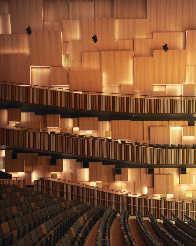
But when you enter the concert hall, designed with Swedish acoustician Jan-Inge Gustafsson and his team, it is all about wood: “We knew it was going to be a shoe-box design. We discussed what’s important for great acoustics, like the surfaces, dimensions, angles, and we did tests. At one point Jan-Inge and his team even went to Vienna to the Musikvarein [1870] and scanned the entire space to understand why the acoustics there are still considered second to none.
I was also looking at the art compositions of Piet Mondrian and that became an inspiration for the way you can divide surfaces; but rather than colour we started working with depth. Still today people talk about the “Mondrian boxes”, but they are driven more by acoustics. We started in 3D, and then we would ship our model to Jan-Inge who would test it as digital models and guide us. The acoustics became a beautiful design driver. Sometimes you want a small scale that grows almost like a fractal; and the tilts give it a playfulness. Every box is individually placed.”
“The natural oak was the best decision because it is like stepping inside an instrument. Wood is also a great surface for acoustics. It is a local material, but there is also the idea of coming from the city space through the exposed concrete into detail and warmth. Inside, there are small brass panels around the doors, brass handles and lamps outside, so these small droplets link all three spaces. With Jan-Inge you also hear the music with your eyes and with your hands.”
Like the Mondrian boxes, the vertical ribs by Gustafs inside the congress centre contain LED lighting. But Ahlmark returns to the concert hall: “The funny thing is that the last test on the acoustics was literally made on opening night. Before they started, Jan-Inge went up on stage with a paper bag, blew it up, got all the information through the microphones, and said ‘Spot on!’ It was a once in a lifetime experience to work with these guys.”