Our latest news and views English
Underpinned by our Scandinavian design heritage, we bring you regular stories about architecture and interiors, exploring natural materials, acoustics, and the creation of safe and harmonious environments.
Colin Moses, Director with MCW Architects, reflects on the design of study spaces in higher education facilities, referencing the library at the University of Bedfordshire’s Luton campus.

“Keep it simple, concentrate on things like good daylight and layout, and don’t get too bogged down in current technology,” says Colin Moses when we ask him how to design university buildings that will be appreciated for years to come. MCW, which he founded together with Murdoch Cameron and Peter Williams in 2011 have, over the years, developed a specialism in higher education. “Remember, whilst spatial drama is important, it should always be about usability.”
The higher education sector has recently been faced, in the UK at least, with a number of issues. With the country’s departure from the EU, competition for overseas students has grown. Tuition fees have increased, and there’s now more pressure to provide state of the art, high quality spaces so that students feel that they get enough value for their money. Most recently of course, higher education establishments have been substantially challenged due to Covid-19.
“Students have become much more sophisticated, discerning and visually literate,” explains Moses “There’s a lot more scrutiny from the student body.” MCW have been working with the University of Bedfordshire for many years, most recently on a library in Luton, a town located just over an hour’s drive from London. During the early stages of the design process, there was a good deal of dialogue between the university’s real estate team and the student body, as well as various members of the faculty. An interesting learning was the desire for quieter areas. Moses says, “In the early 90s, the thinking was that the future of library space would be social and active, but what we heard from the students was that they still needed very quiet, in some cases dedicated silent areas to focus.”
This library project, which was completed in the summer of 2016, features a range of study rooms, group work areas, presentation practice rooms and a café. The new building serves as a focal point between academic space and student accommodation and is also part of the town centre’s regeneration. Due to the lack of available footprint, the building stands seven floors tall and has a concrete frame with modular precast elements on the outside, giving a distinctive appearance, intended to imbue civic pride.
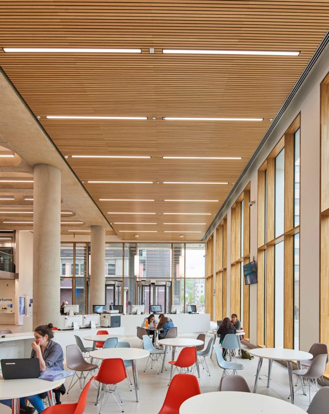
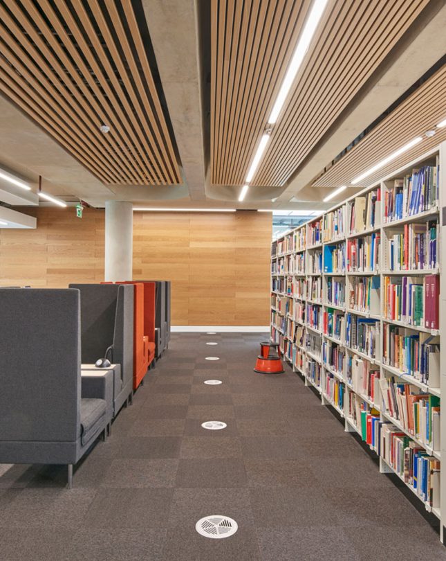
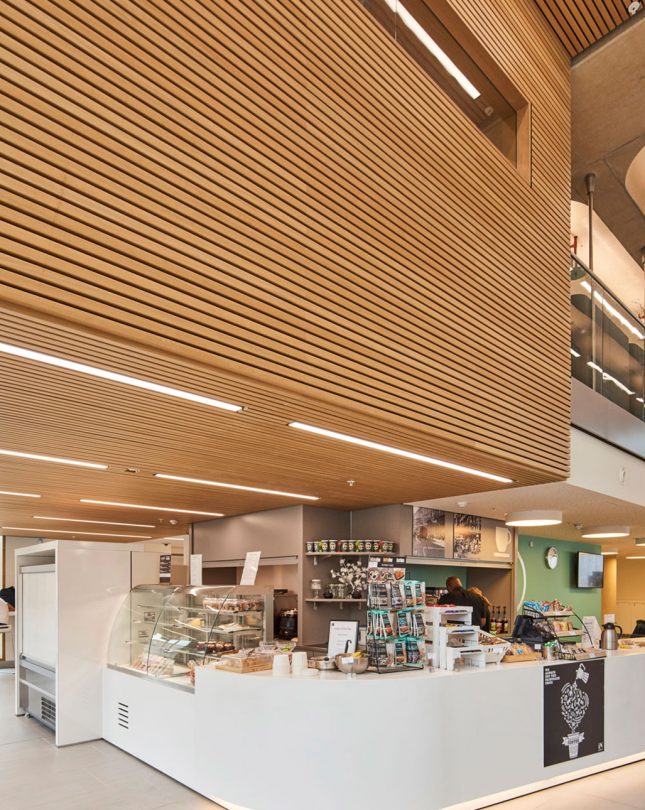
The brief called for an ‘efficient, serious and scholarly facility’. A double height space leading off from the streetscape features over 3000 individual 20mm Gustafs ribs in natural oak veneer. The ribs have been used for both the walls and ceilings, cladding the open atrium and cafe, as well as the library aisles and study spaces. “It gives a real feeling of warmth and theatre,” says Moses. The atrium also has a mezzanine level where students can interact with the academic support team.
While the ground floor has a mix of active and quiet areas, silent spaces can be found on the upper floors in a ‘study wall’. This feature is a narrow strip between the bookshelves and the acoustic glazing, which also offers excellent views and ample daylight. A traffic light system of red, amber or green light triggered by sound monitors help to reinforce the desire for peace and quiet.


Back when this project was completed in 2016, few could have foreseen the current pandemic. Nevertheless, measures such as mask wearing, social distancing and sanitisation stations plus MCW’s future-facing design has enabled library life to continue, allowing students to come together and enjoy the building’s peaceful study spaces once again.