Our latest news and views English
Underpinned by our Scandinavian design heritage, we bring you regular stories about architecture and interiors, exploring natural materials, acoustics, and the creation of safe and harmonious environments.
Colour expert Karen Haller tells us how behavioural colour and design psychology can create harmonious interiors.
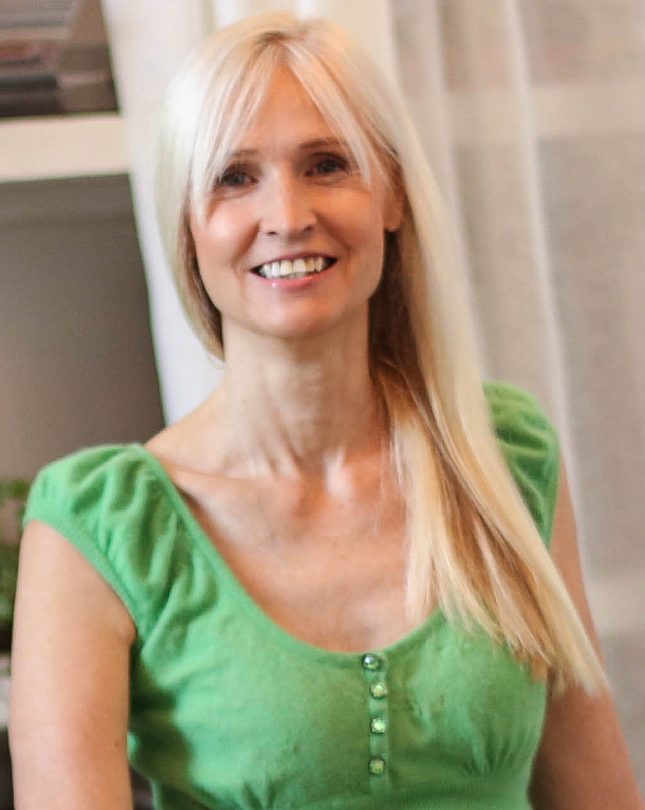
A leading international authority on behavioural colour and design psychology talks about how designers can approach colour in interiors.
We chat to Karen Haller who uses applied colour and design psychology to consult, collaborate and create with a range of individuals and businesses to improve harmony and wellbeing, and create positive change.
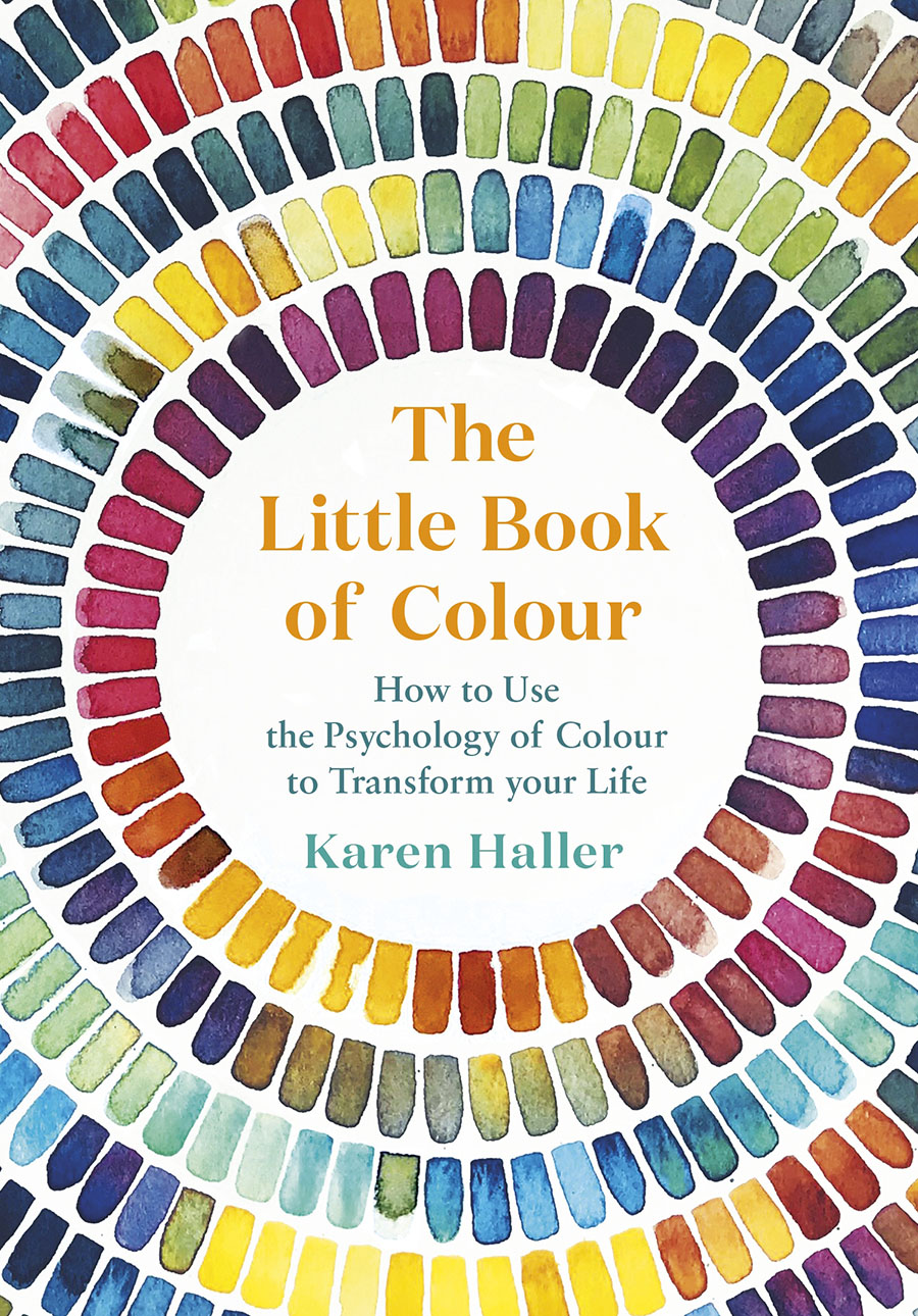
“Colours and patterns affect our experience of spaces” begins Karen Haller, a colour expert and author of The Little Book of Colour. “The study and application of colour and design psychology focuses on how we can use this to positively influence how we think, how we feel and most importantly behave.” This discipline, she continues, “is based on nature, with the aim to positively improve our human experience in balance with nature.”
Eschewing the colour wheel and complete reliance on colour trends, Haller says, “it’s not about choosing a colour just because it is aesthetically beautiful. It’s about how design can create a positive response in human behaviour, particularly in terms of mental wellbeing. It’s a way to use colour and design that is measurable.”. While it’s tempting for architects and designers to use colours that are to their own particular taste, what Haller’s teaching is concerned with is establishing a framework to combine both intuition with logic and rationality.
“How we test and measure is important too. In order to improve something, first we must be able to measure it. Depending on feedback, you look and then tweak and change.”
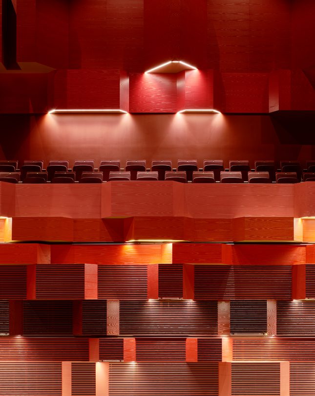
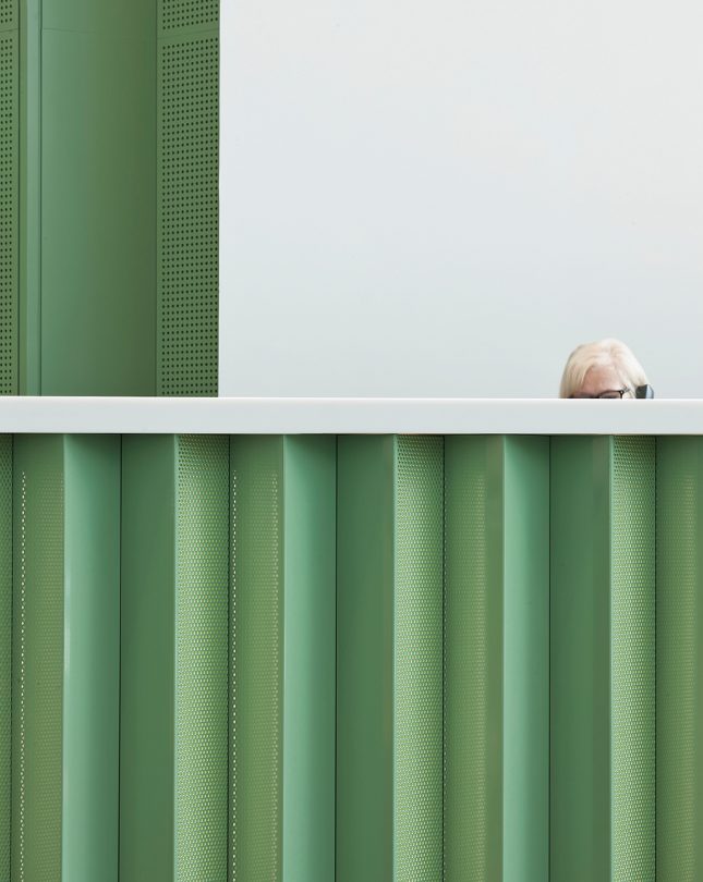
Central to Haller’s philosophy is that going back to nature is the future of design. “It’s why we sit in the park on our lunch break, why we go for a walk in the woods on the weekend, why we take holidays by the beach, or walk barefoot on the grass. Because most of us innately know that connection to nature restores us, re-energises us, grounds us and supports us,” she explains. It’s no surprise that we want to recreate that feeling of being in nature within the four walls of our homes.
When considering natural materials in interiors, Haller says that they should be treated in the same way as any other surface or object. “They will belong to a colour family. The pattern, texture and shape of materials should all be considered. Colour and design psychology can be used to pull together these design elements, taking into account the client’s needs, context and positive outcomes to create a harmonious interior.”
When talking further about colour and harmony, Haller likens putting together colour combinations to a piece of music, “There’s no such thing as a wrong note. You can have a beautiful symphony but if there’s a jazz chord in there, we sense the discord, the disharmony.” It’s the same with colour and design she says: “there are no wrong colours. We don’t respond to just one colour but the combination of colours including factors like saturation, proportion and placement. This is because as humans, we are always calibrating, always looking for harmony.”
Follow Karen on Instagram: @karen_haller_colour
