Our latest news and views English
Underpinned by our Scandinavian design heritage, we bring you regular stories about architecture and interiors, exploring natural materials, acoustics, and the creation of safe and harmonious environments.
While artist Paul Klee may have famously likened drawing to ‘taking a line for a walk’ in the early part of the twentieth century, creatives in other disciplines – from fashion designers to architects – have also played with the idea of lines over the years. We explore the current trend for linear forms in wood panelling to achieve a sense of scale and bring the outside in.

Vertical lines have been found in fashion through the ages. Renoir captured a stylish nineteenth century woman in black and white stripes in his famous ‘La Loge’ or ‘Theatre Box’ painting while for men during the same era, the striped suit was, according to British fashion historian Colin McDowell ‘an essentially urban fashion statement’. The pinstripe suit then was either thought of as a type of uniform worn by employees of different banks or part or the formalwear associated with certain sports such as boating.
In the following decades, pinstripes became synonymous with gangsters of the 1920s and 1930s and also with the androgynous of German-born film star Marlene Dietrich. Move along a few decades and striped shirts were viewed as a dandyish rebel style statement. And British fashion guru Paul Smith opened his first eponymous shop in Nottingham, England in 1970, a brand which since then expanded globally but where the signature style remains, always featuring stripes in a range of colours.
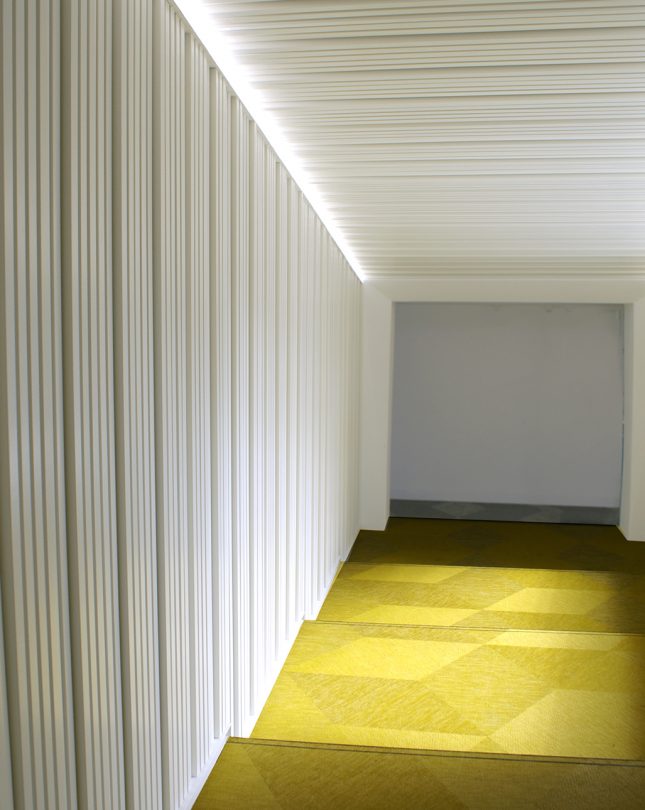
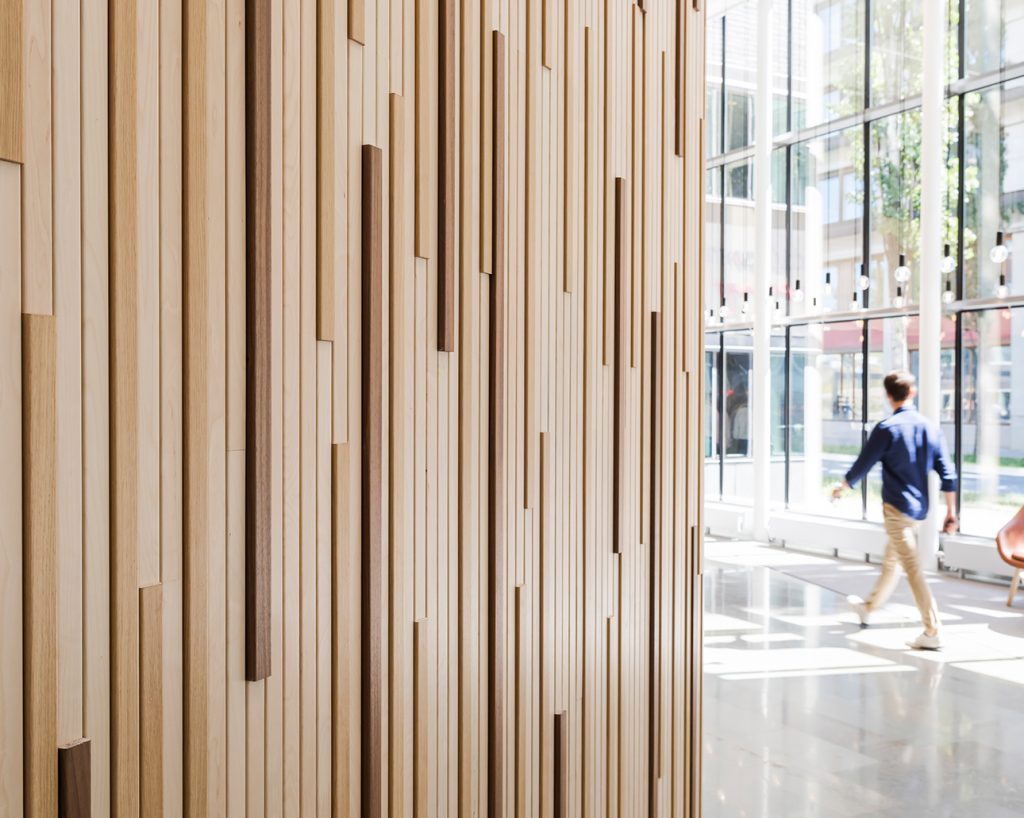
And whilst clothing with vertical lines are said to have a slimming, flattering effect on the wearer, vertical forms can create an optical illusion in a building too. Using wooden vertical planks or ribs provides another layer of interest, drawing people’s eyes up into a particular space, perhaps making it seem larger or taller depending on the depths and widths of the planks and the way they are artfully arranged. The sheer scale of the architecture can also be emphasised – for instance in a statement atrium space, working with the natural light that floods in to create extra drama.
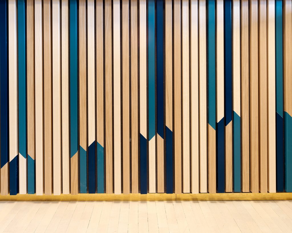
Colour is also something architects are playing with when using vertical wall panelling. The natural tones of wood planks can create a warm, calming interior, while interspersing these with one or two colours, using pigmented veneers alongside the natural wood tones can give the interior energy.
Vertical wood panels can add texture and character in a way that a smooth wall surface does not. The three dimensional nature of the vertical wall panelling can provide good sound absorption too, particularly in large, open areas.


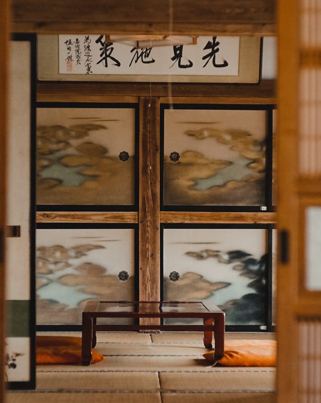
The vertical panels can also be said to mimic the trunks and branches of the trees that provide the raw material of the panels, emphasising their natural beauty. As the Japanese concept of forest bathing, or shinrin-yoku, becomes established across the world, perhaps the trend for slatted wood panels also has its origin in Japan. The linear shapes evoke the idea of zen-like spaces, minimalism and clean lines in interiors. In Japan, rectangular-shaped tatami mats often form the basis of an entire internal space, with straight lines and symmetry replicated in many other features. It is clear that the combination of natural materials and linear elements bring harmony to a space.
There is an art to using linear effects in architecture, whether that’s in a workplace, educational establishment, gallery or even a residential space. Whilst the vertical panels bring a sense of rhythm and scale to a space, the linear wood elements bring nature into an interior and also create a sense of calm, which are all desirable qualities in the world we live in today.
